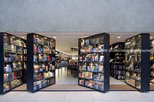
livraria da vila - alameda lorena são paulo sp, brazil
- tech chart
- architecture author: isay weinfeld collaborator: domingos pascali project manager: monica cappa team: marcelo alvarenga / juliana garcia / leandro garcia dates date of commission: sept 2006 date of completion: apr 2007 buit area: 790,00 m² building general contractor: fairbanks & pilnik structural engineer: stec do brasil engenharia foundation engineer: stec do brasil engenharia mechanical, electrical and pumbling engineers: mvf instalações landscape design: isabel duprat sound: homesystem graphic design: roberto cipolla suppliers cement floor: cada canto ceramics: gail – banheiros/ copa stones: clodomar sanitary ware: deca precast concrete panels: concresteel glassware: casa dos vidros lightning: cia de iluminação stainless steel : fabrinox skylight: agrotan serralheria: swatt woodwork: legno marcenaria acrylic work: acriresinas
- description
the livraria da vila is the result of the refurbishment of a two-story house, built on a very narrow plot in são paulo.
from start, it was clear an open plan was needed, as to better arrange products and circulation. for that reason, significant structural alterations were performed to the existing building, such as the incorporation of metal parts that would make it possible to displace the pillars to the outer sections of the building, and reinforce its foundations.
the inclusion of one level – basement – allowed for the setting up of an entire floor exclusive for children, in addition to a small auditorium, to hold courses and lectures.
we believe that in a commercial venue, a project must always be developed to enhance the product, its in-store merchandising, and its sales. there are, undoubtedly, innumerable ways to achieve this goal, and it is probably the nature of each approach that distinguishes each project.
we, in particular, strive for solutions that will allow customers to experience the product as comfortably as possible.
in the case of livraria da vila, such comfort is translated into the composition of low-ceiling spaces, dark tones, indirect lighting and infinite shelves – in careful disarray – covering all walls to the ceiling. whichever direction one looks at, there are books, and an unpretentious feel, reminding that of used-book stores, making customers at ease to browse the shelves for the books they want, to leaf through or even read them in the couches and easy chairs scattered around the multiple stories.
the pivoting window-shelf-doors, and the voids “connecting” one floor to the next, are other project elements that, unexpected, invite customers to enter and explore the store and its various spaces.


